We’ve had websites for so long that we’ve come to expect them. However, for many internet shoppers, they are still a good place to start.
You might lose out on a lot of possibilities to interact with your audience if they have a negative user experience after visiting your website, from providing the business more credibility to developing sales funnels.
Remember that merely adding fresh material isn’t enough; you must also maintain track of all the aspects that influence the optimization and its ranking.
You can make a lot of changes to your landing pages to make them more user-friendly, starting with the design and moving on to backend alterations. Let’s go through some methods that will provide a positive experience for your visitors while also enhancing your SERP ranking.
Readability and Easy Navigation
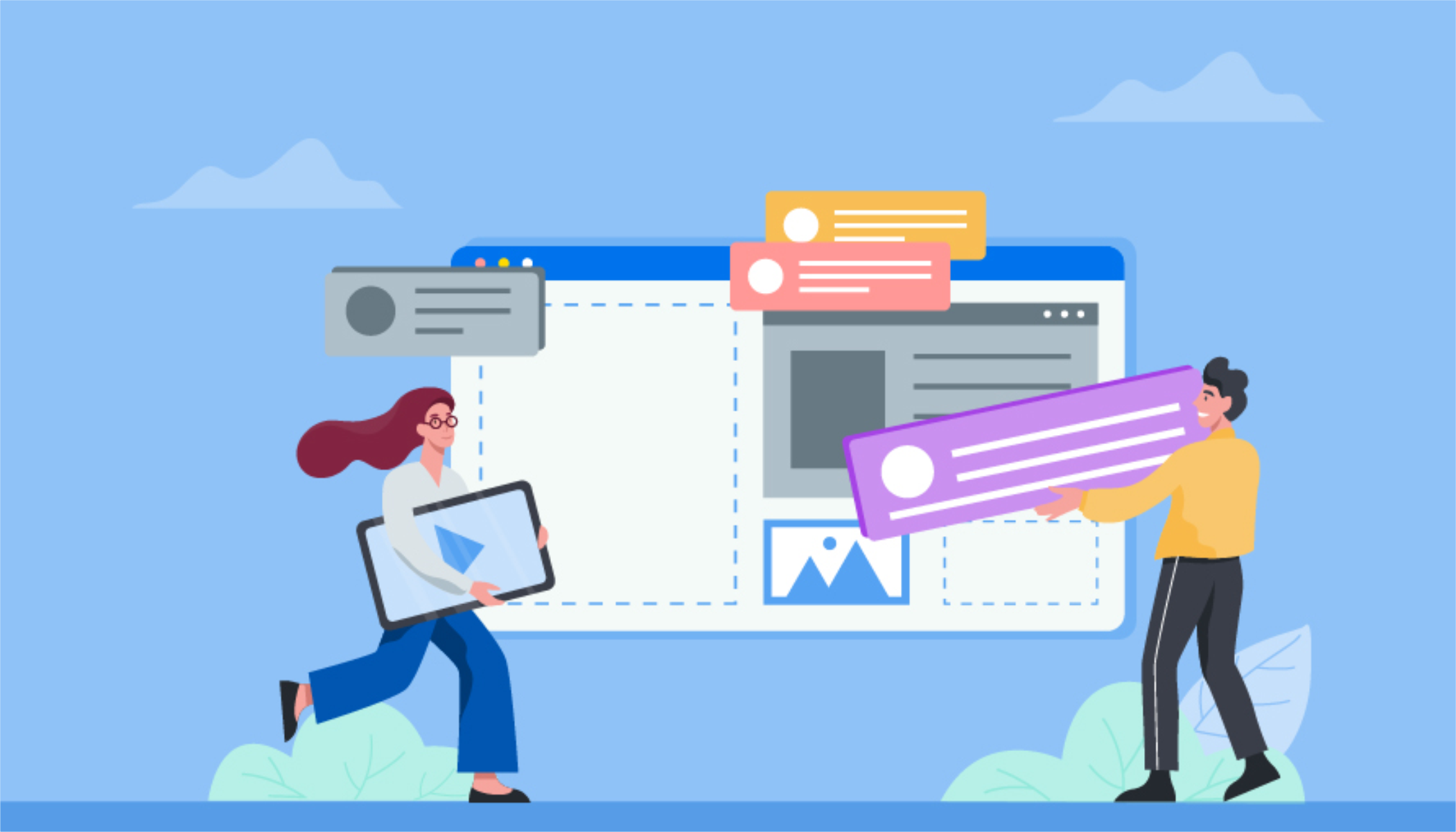
Putting technical jargon aside, the aesthetic appearance of your website is one of the most important things that influence users’ perceptions of it. This isn’t just about visuals or nice color choices (though those are crucial, too). The way you lay up all of the items on a page has an influence on UX, which is why you should always approach modifications from the perspective of the user.
Content and Design
User testing is one of the most effective techniques to see if your website’s visual presentation is up to par. This allows you to learn the ins and outs of anything that may be a problem for a typical visitor.
Using usability testing software like PlaybookUX might help you save time in the long term. You may use it to see how actual people engage with your website, determine which items resonate with your users, and learn about their needs before adding new pages. As a result, the testing process may be simply scaled.
Content readability is one of the most important parts of making anything more user friendly. You should consider how consumers will interact with it in addition to a clear, legible typeface (never put style above utility when it comes to fonts). Many visitors will simply skim through material, therefore you must do all necessary to make the message as accessible as possible.
The following are some suggestions for making information more readable:
- Useful headlines and subheadings — Use a single H1 for a page’s subject, and consider H2 as chapters for the content underneath. Use H3 for sub-sections if you need to go into further detail.
- Lists of numbers or bullets.
- Paragraphs that aren’t excessively lengthy. They should contain no more than 2-3 sentences in total.
- A combination of words and graphics
- Italic and bold typefaces Use them instead of all capitals or different font sizes to make information stand out.
You may also boost readability by using contrasts and highlights at the right places. This is especially vital when it comes to links: visitors should be able to distinguish them from other content at all times, therefore they must appear clickable.
Organization
Links should not only be immediately identifiable, but they should also make the user’s journey across the website easier. They should also direct them to relevant pages and recommend information that is linked to what they’ve read.
Also, be sure to include CTAs – they should appear at relevant points in the visitor’s journey and make taking a certain action understandable.
It should be easy to move around the website. You must structure your material in a logical manner and give user-friendly methods for engaging with it.
Consider your website’s search feature and how to improve it to do this. Here are some tips to help your audience enhance their user experience:
- Allow for various spellings and typos to make it easier for users to find what they’re looking for.
- Make content suggestions and highlight keywords that might direct users to a relevant page.
- Display the most recent additions at the top of the page so that consumers may save time searching through material.
Here are a few more ideas to help you arrange your content:
- Start with the most crucial facts.
- Avoid industrial jargon and acronyms that are difficult to understand.
- Use tags to organize your information so that visitors can find it more easily.
- Don’t cram too many items into the navigation bar.
- Get rid of dead ends, such as pages that don’t have any links.
Usability, Responsiveness and Accessibility
After you’ve taken care of your website’s content and presentation requirements, you’ll need to move on to the technical side of things. Make sure you’ve done everything you can to make your website as user-friendly as possible for all of your visitors, regardless of how they get there.

Compatibility
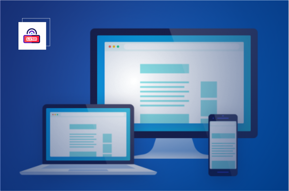
Mobile devices, excluding tablets, account for more than half of all website traffic, thus a mobile-friendly responsive and scalable experience should be standard. Regardless of the device they use to access the site, each user should have a nearly comparable experience.
All components, from navigation to text and photos, should be formatted, resized, and spaced automatically.
When we say that your website is responsive, we don’t only mean on mobile devices. You should also ensure that each browser and operating system is supported similarly so that you can reach a wide audience.
If you’re not sure how to speed up your loading times, avoid using too many movies, optimize your graphics and fonts, delete non-essential widgets, and disable third-party plug-ins.
When it comes to wide-spread access, don’t only think about how people can visit your website. Users should not face any difficulties in accessing your material.
Keep in mind that your website may be accessed by individuals with impairments. Use site design approaches that will provide everyone a consistent experience. Add audio navigation, for example, to make the sites accessible to visitors who are blind.
For example, The Disability Trust’s homepage prominently displays numerous accessibility options towards the top of the page.
Users should also be aware of what is happening in terms of their behaviors at all times. Each mistake, for example, should be clearly identified, with instructions on how to proceed. It should always be obvious to users what they must do to achieve the intended result. Adding a direct call widget to the contact area is another example of this.
If you’re using forms to collect feedback, for example, don’t ask for too much information and instead offer a progress bar so customers can see where they are in the process.
Technical setup
Finally, think about how to deal with any backed-up concerns that may arise. It’s critical to do rigorous tests to identify any issues that might cause your website’s functioning to suffer. Broken links are another factor that affects user experience, so you’ll want to clean them up so that you’re left with material that doesn’t disrupt the user’s flow.
Aside from functionality, you should do frequent security checks to ensure that everything is up to date. Google favors websites that are protected by an SSL certificate. This difference denotes a handful of key aspects that both improve your search engine ranking and offer people more confidence in your ability to trust you:
- Data on websites, such as passwords and e-mail addresses, is safe from hackers.
- Your page’s identification is verified by a third party, ensuring that dangerous and fraudulent pages do not utilize your website’s name.
Running the URL via Google Safe Browsing is one of the greatest ways to ensure you have the green light.
Users will be cautioned not to visit your website if you don’t set it up properly, and you may lose a lot of traffic as a result.
The simplest approach to determine whether your website is safe is to search for a padlock symbol next to the URL address, which indicates that security is enabled.
To make your website even less vulnerable to outside threats, keep your plug-ins up to date.
Summary
When checking to see if your website is user-friendly, look through all of the ways your users will interact with it and see if everything works as it should. This manner, you’ll avoid user dissatisfaction, which may have a long-term influence on your website’s ranking and the business as a whole.

Begin by doing a usability test and going through your material. Consider how consumers will view it, if the design is easy to understand, and whether everything is organized in a straightforward, effective manner.
The next phase should be optimization, which is ensuring that as many users as possible can access your material without encountering any barriers, such as devices, systems, or personal barriers.
Finally, get into the technical side of things and keep security as tight as possible to boost your score and demonstrate to your users that you are trustworthy.
Article Source: BAREMETRICS BLOG